As Splunk consultants, it’s common to come across customers who have a Splunk license and are ingesting data, but have yet to learn or have taken the time to develop their own Splunk dashboards. Most of us (and our manager’s manager) would agree that one of the nicest things about Splunk is its ability to translate the data in our environment into something that is meaningful, and visual.
If you’re new to Splunk and are simply utilizing the Splunk search bar, and are relying on the saved searches that a professional services consultant left for you, then you’re not using the basic functionality of Splunk to its fullest extent. Not only do dashboards bring meaning to your data in a way that is useful in troubleshooting and translating concepts to others, but they can be fun to build.
We’ll skip the discussion regarding ‘what are we going to search for in a dashboard?’ — that question in itself could become a blog post. In this post, we’ll work through the basic mechanics of getting up and running with a dashboard.
Let’s Get Started!
Step One: Create The Dashboard
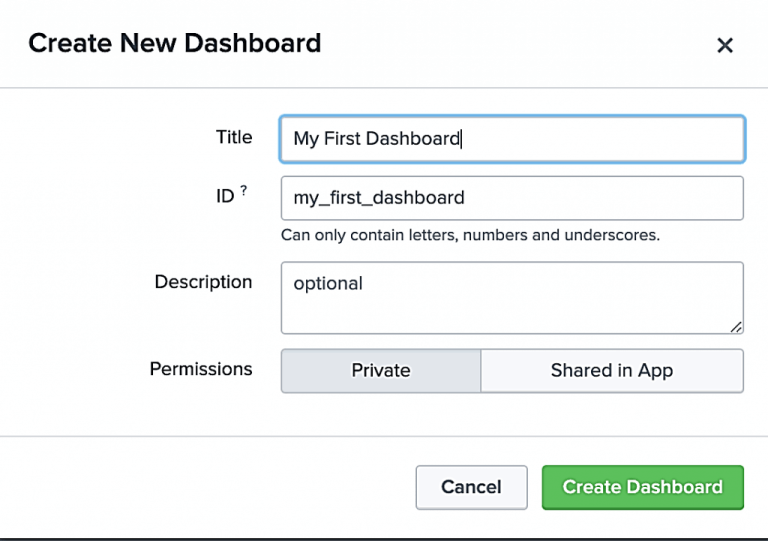
- From the search app, choose “Dashboards”
- Select “Create New Dashboard”
- In the next dialogue, give your dashboard a Title and Description.
- Keep the permissions set to ‘Private’, and click “Create Dashboard
Step Two: Add inputs
You will now be shown a blank dashboard. I recommend starting with two inputs: date & time.
- Dropdown the “+Add Input”
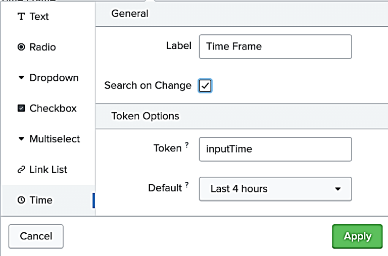
- Select to add both a “Time” and a “Submit” input control
- Label: “Time Frame” (Label is the text that will be shown above the control)
- Token: “inputTime” by convention
(I usually name all of my tokens from input controls with the prefix of ‘input’. As dashboards grow, using a standard naming scheme can be helpful.)
- Search on Change: Optional
- Default: “Last 4 hours”
Step Three: Add a panel (or visualization) in order to display the results of the Query
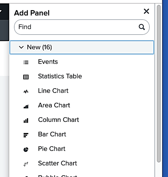
- Choose the “+Add Panel” dropdown, this will open a new dialogue
- Choose “New” and select “Line chart”
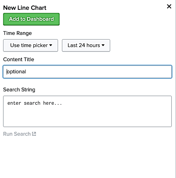
Step Four: You will now be shown a dialogue asking for specific attributes for our line chart.
- Within the dialogue, enter the Search String, index=_internal |timechart count
- Give the Panel a title: “Events over Time”
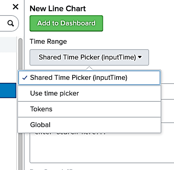
- Choose the Time Range: Drop down the menu
- Choose the Time Range picker that we created in Step 2.
- This should be called “Shared Time Picker (inputTime)”
- Click “Add to Dashboard”
Step Five: Once you are returned to the dashboard, save your work by clicking “Save” in the upper right corner.
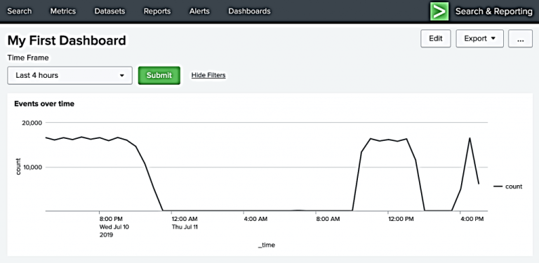
- You should now see a one-panel dashboard such as below.
- Try changing the time by dropping down the time frame and choosing 24 hours.
- The chart should change immediately. If not, go ahead and click “Submit”
Congratulations on your first dashboard!
Try adding additional searches to the same dashboard. This can be done by repeating steps 3-6 as shown above. By utilizing the same Shared Time input, all of the searches will align within the same time window.
As you practice, try to get creative with your choices of visualizations and take time to ensure that your visualizations actually make sense for the type of data you’re trying to convey.
About SP6
SP6 is a Splunk consulting firm focused on Splunk professional services including Splunk deployment, ongoing Splunk administration, and Splunk development. SP6 has a separate division that also offers Splunk recruitment and the placement of Splunk professionals into direct-hire (FTE) roles for those companies that may require assistance with acquiring their own full-time staff, given the challenge that currently exists in the market today.

